How do you get consumers to trade up when buying milk? As the dairy market continues to be commoditised by aggressive price competition on standard milk, suppliers and retailers are looking to new added-value milks commanding a premium to drive value back into the market.
But NPD is only one part of the value-adding puzzle. To achieve a true step change, the very environment in which consumers shop - the supermarket liquid milk fixture - needs to encourage trade-up. Yet fixture designs and layouts have barely changed over the past decade, with rows of wire trolleys dominating the fixture and all manner of functional, flavoured and alternative milks cluttered around them. Not very inspiring or premium-friendly. So what can retailers do to create a 21st centure milk fixture?
To get the debate started, The Grocer asked Synergis - a retail marketing agency that has worked with the mults and the dairy industry - to come up with four fixture designs fit for the 21st century, which we then put to leading industry experts. We were looking for design ideas requiring varying degrees of investment - from minor tweaks to wholesale overhauls.
Despite this scalability, the designs have one element in common - they retain the trolleys for standard white milk. “The retailers we spoke to when researching the fixture were very clear that we had to consider the practicalities of stocking the fixture and the fact it’s a very high turnover area in store,” Synergis MD Russell Abbott explains.
Showcase sections
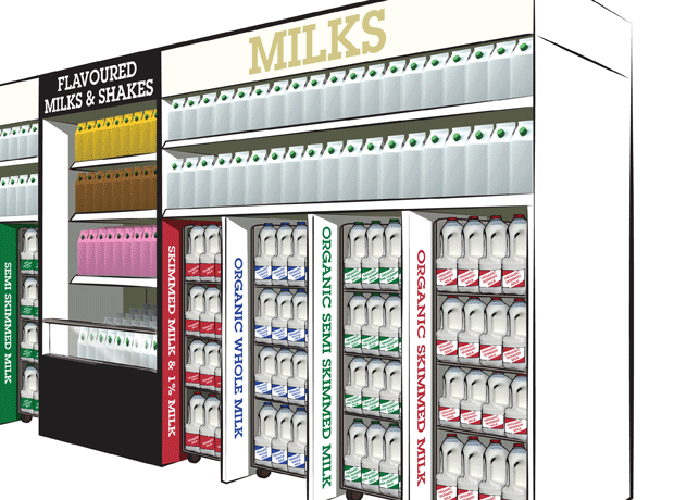
To give premium milks greater visibility, Synergis’s designs introduce showcase sections for added-value products, either as a central pillar in the middle of the fixture or as a side shelf at the side. “We wanted to create a focal point,” says Synergis creative director Brian Monet. “At the moment, you have a bank of trolleys and it all becomes a bit of a blur. We wanted to disrupt the shopper.”
It’s a concept that strikes a chord with Sandy Wilkie, sales and marketing director at Robert Wiseman Dairies. “It makes tremendous sense to focus on premium products and having a focus area within the fixture is an excellent way of doing it,” he says of the central pillar. Synergis has put flavoured milks in the pillar and side shelf, but they could be used for added-value milks or free-from milks. Wilkie suggests retailers keen on highlighting local sourcing credentials could also be tempted to put regional milks into the pillar, “and you would also want to think milks such as A2 would go in there.”
The central pillar also resonates well with Hamish Renton, of Hamish Renton Associates, whose CV includes stints at Milk Link and Tesco. “It’s quite practical and it gets footfall to the middle of the fixture, which is where you want people to be,” he says. “What it says subliminally is the main event is in the middle. You’re offering a clear trade-up and putting value into the category.” Using the colour black- not widely used in dairy - further helps to enhance the premium feel of the central pillar, he adds.
Renton doesn’t give the pillar an unqualified thumbs-up, though. The well-like area at the bottom of the pillar looks great but doesn’t work hard enough for the retailer, he says. “This fixture needs to do about £25 per square foot, and this is just dead space.” The proportions of the different milk SKUs as shown in the Synergis designs also don’t reflect the market. “You wouldn’t devote a third of the fixture to organic and you’re under-faced on semi-skimmed.”
Paul Shaw, head of customer marketing at Dairy Crest, meanwhile, believes having a side shelf at the end of the fixture - as in the designs on p6 - is a better option, especially for flavoured milk. “We’ve recently been doing our own shopper research, and it was surprising to see how much behaviour differs for flavoured milk,” he says. Consumers perceive flavoured milk as a “treat” rather than a standard milk purchase, which means flavoured milks should be moved away from conventional white milks, he adds.
This is echoed by Sara Robinson, category manager at Arla. However, her wider approach to fixture reorganisation is markedly different from anything Synergis has proposed. It’s well known consumers shop for milk by colour, so instead of fighting this it makes more sense to integrate added-value milks into the existing structure of the fixture, she says. “So the skimmed section would have conventional skimmed but also organic skimmed, filtered skimmed and products like Flora pro.Activ, which is made with skimmed,” she says. “The more you make these milks feel like normal milk, the better.”
Jonathan Colley, Arla head of commercial category development, adds free-from milks should also be taken out and moved to a dedicated chilled free-from section similar to the ambient free-from aisle. “That would create consistency and shoppers would know where to find all free-from options. You then have scope to create greater clarity for white milk.”
Fins and wings
In our designs, clarity is created through the addition of fins or wings. Product descriptors - such as ‘semi-skimmed’ - and brand fins (see below, right) add colour to the fixture and ease navigation, says Monet. “Plus it’s probably the easiest and cheapest part of our designs to implement.”
Wilkie agrees the fins would be easy to do “without massive investment” and points out retailers in the middle ground are already embracing this idea. But he might use fins for other messages, such as sourcing policies on local milk, for example. Renton is thinking along similar lines. “I would probably use them for upselling and to highlight provenance,” he says. “Using the brand fins for offers and promotions is fine, but we know from the farmer protests that milk is very emotive, so why don’t retailers use other fins to showcase their farming schemes?”
Fins are easy changes, but for a truly radical change to the milk fixture one need look no further than chiller doors, as used in Synergis’s fourth design, which envisages the fixture being built into a store wall and replenished from the back. It’s the most expensive of the designs and would be most feasible for new builds rather than existing stores, but doors could offer a real opportunity, believes Monet. “Shoppers are on autopilot,” he says. “When you have doors to open, you are forced to spend that little bit more time making an active decision about what you’re going to buy, giving new milks a better chance of being noticed.”
Renton agrees doors would slow down shoppers - and that’s why he doesn’t like them. “It creates a distance between shoppers and products.” Given milk is a high-turnover product, there are also practicalities to consider. “People will be blocking each other with trolleys and won’t be able to open doors at the same time,” he warns.
But Wilkie disagrees. He recently went on a research trip to the Netherlands - where the government has passed legislation compelling retailers to fit doors on chillers - and was impressed with the doors he saw there. “They’re actually a very, very attractive option,” he says. “The entire fixture just sparkles. If you put an illuminated header above it, it would look great.” Crucially, the new generation of doors, including models without hinges which can be moved by 180 degrees, mean a fixture behind glass doesn’t have to spell logistical nightmares.
Shaw also sees the appeal of a door-fitted, rear-replenished fixture. “It’s fantastic in terms of ease of rotation, stock replenishment and not having staff interrupt customers on the floor,” he says. “It’s the way to go and frozen food shows it’s possible.”
While the cost of a chiller door fixture may be prohibitive for some multiples, it could prove a more realistic option for the convenience sector, where fixtures are smaller - and therefore cheaper and easier to fit - and high-volume traffic in front of the fixture is less of a concern. “In a convenience store it’s a no-brainer, really, just not in a supermarket,” says Colley.
Renton says he could also see some retailers go for a “half-way house” approach on chiller doors, putting part of the fixture - such as premium lines - behind glass, while leaving the high-volume white milk lines as they are. “That would give you some stand-out without making the fixture unmanageable,” he adds.
In addition to Synergis’s ideas, there are further adjustments our experts would like to see. Shaw is keen to add more colour and use it to convey the story behind the milk. “A lot could be done to bring the countryside into stores and take away the clinical feel of the fixture,” he says. “If you’re using a plinth or pillar at the end of the fixture, there’s also an opportunity to use that space: to communicate the goodness of milk to consumers, for example.”
Wilkie says Wiseman is putting a lot of emphasis on changing strip lights to LED lights. “It’s all we’re installing in the middle ground these days,” he says. “It makes the fixture brighter, clearer and lighter, and it’s cheaper for the retailer.”
As for which of the four designs would be most suitable for different retailers, Renton picks out the central pillar as “quite top-end, so perhaps good for a Waitrose or a Sainsbury’s, while the side pillar with brand fins could work in Tesco or Morrisons.”
Overall, the designs are hitting the right nerve, says Shaw. “We’ve been doing our own research on fixture improvements and there are a lot of ideas here which are similar to our own thinking. That’s encouraging.” There may not be many added-value milks around at the moment, adds Colley. “But they are coming and retailers need to be prepared for that. Milk is probably the busiest chilled fixture and it’s already very difficult to get new product in. If you grow the market and get consumers to diversify what they buy, something will eventually have to give.”
The rewards for taking that plunge and overhauling the fixture could be significant, believes Renton. “The first retailer to get serious about merchandising in that aisle and really serious about ramming home its credentials on dairy is going to see a benefit,” he says. “I’m just surprised it’s taken so long for the penny to drop, really.”
No comments yet