This article is part of our Frozen digital feature.
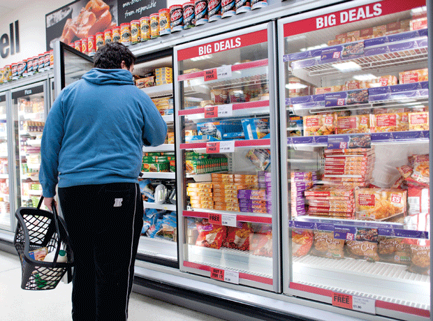
The frozen aisles can be uninspiring and unwelcoming. In fact, a third of consumers believe the way frozen food in-store is displayed is unappealing, according to exclusive research for The Grocer, and a quarter of shoppers think the aisles are too cold, which discourages browsing.
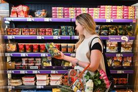
But that doesn’t have to be the case. Birds Eye believes the frozen aisles are filled with potential, they just need a helping hand to make them more inviting. So they teamed up with Sodalite Creative to reimagine them. Here’s what they came up with:
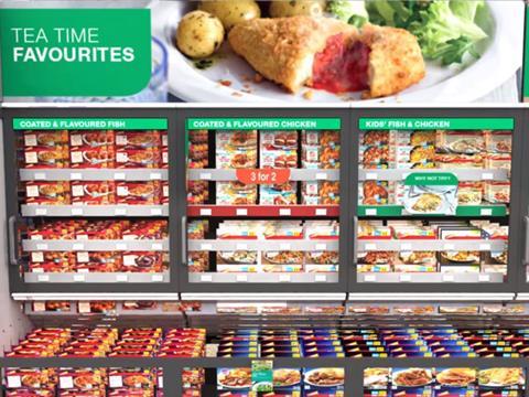
The first steps are relatively simple – installing more user friendly signage to help bring the aisles to life. This includes headers, dividers and fins to subdivide the categories and create ‘hero’ sectors, allowing certain products to stand out. Adding a splash of colour with these does wonders to help brighten the aisles and make them more inviting.
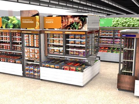
Frozen food can be enhanced further by creating a shop within a shop environment, although Birds Eye is keen to highlight this is a much longer-term vision for the category allowing it to fit in with retailers’ refits.
And, notably, Birds Eye believes the freezer aisles should be divided by different shopper missions such as Quick & Easy, Inspire Me, and Teatime Favourites while keeping the basics such as Chips & Potatoes, and Peas.
A systematic approach is needed, adds Birds Eye, and its reimagining of the in-store environment goes beyond basic upgrades such as signage and better segregation. Sampling could also help convince consumers to visit the aisles, while improving the ambience through lighting, the use of colour and freezer types would allow them to feel more comfortable once there.
Topics
10 Things You Need To Know About... Frozen Food
In the latest instalment of The Grocer’s series of digital features, we delve into the freezers to find out the cold hard truth about the frozen market. We’ve quizzed retailers, brands and consumers about the current state of the sector. So, who’s been frozen out?
- 1
- 2
- 3
- 4
- 5
- 6
- 7
- 8
 Currently
reading
Birds Eye reinvents the frozen aisles
- 10








No comments yet