

We challenged agencies to create packaging fit for the future. Ideas ranged from a refillable ice cream carton to a seaweed-based butter wrapper
Dairy isn’t typically known for exciting packaging. So, on the rare occasion genuine innovation hits shelves, it’s cause for some celebration. Take Cathedral City’s revamp of its cheddar range in summer 2022, which added a side-opening mechanism designed to cut 40 tonnes of plastic per annum from the waste stream.
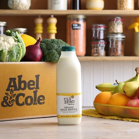
Also see Abel & Cole’s refillable plastic milk bottle, unveiled in autumn 2023, which promises to save the dairy industry 300,000 tonnes of carbon a year.
Both innovations have a clear focus on sustainability. But that’s not the only factor to consider in today’s ever more competitive market. UK dairy is in desperate need for packs that are exciting, practical and, most importantly, future-proof.
So, what would the next generation of dairy packaging look like? What are the key priorities for suppliers in design? And what benefits could savvy packaging offer consumers?
Whatever comes next, it won’t come easy, suggests Mustan Lalani, Tetra Pak sustainability director for north & east Europe. “Finding ways of developing more efficient processes for packaging is still one of the biggest challenges facing the sector,” he says.
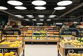
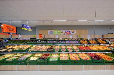
The immediate priority is sustainability. While dairy products are still often packaged in materials from non-renewable sources, many British consumers are actively trying to reduce the amount of packaging waste they generate.
To aid these efforts, some suppliers have already made pointed moves – such as the aforementioned ones by Cathedral City and Abel & Cole. Then there’s Flora, which in January announced a switch from plastic tubs to cardboard cartons for its spreads, saving 25,000 tonnes of plastic per year.
Some materials are more of a problem than others, though. Take flexible plastics. Earlier this month, The Collective unveiled pouch yoghurts made of soft plastics that can be recycled – but at specialist facilities, rather than kerbside.
That’s something the brand wants to change. The Collective “is conscious with its growing pouch business and as the leader of pouches within yoghurts, that recyclability of soft plastics needs to improve”, says marketing director Tor Hunt-Taylor. As such, The Collective is lobbying for progress from the government on kerbside collection and recycling infrastructure.
More from The Dairymen 2024:
-
How the dairy category is getting fit for the future
-
How Matthew Hall raised Butlers from the ashes
-
Why is Unilever selling its cream business?
-
How can plant-based grow again? Dairymen British cheese category report 2024
Outside of sustainability, consumer appeal is a key goal. As shoppers enjoy an ever greater choice on the shelves, packaging has a larger role to play in securing their engagement – whether that be through eye-catching designs, greater emphasis on benefits, or new formats.
We tasked agencies to create packaging solutions for the future. The response was remarkable. We were only able to print five on these pages, but The Grocer site has a full portfolio of suggestions.
Ideas include a reusable and refillable ice cream carton made from stainless steel and ocean plastic, a heat-sensitive seaweed butter wrapper that tells consumers when the butter is ready to spread, and cheese snack bars.
Dairy bosses, take note!
Milk & Dairy Drinks
Canarino
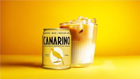
Premiumisation of the dairy drinks category is long overdue. So says The Cabinet, which has put forward Canarino to solve the problem.
The glamorous brand offers the “aperitivo lifestyle without the alcohol”, says Elliot Wilson, the agency’s strategy director. It’s inspired by the trendy café romano serve, which blends espresso with milk and lemon zest.
High quality and natural ingredients are used to justify a premium price point, making it a “luxurious yet practical choice” for younger shoppers.
Plus, Canarino’s drink comes in a sleek 150ml aluminium can. Not only is it fully recyclable, but it also comes with a resealable opening to avoid waste, “allowing you to enjoy Canarino guilt-free”, says Wilson.
The pack has also been designed to be robust enough to be shipped without secondary packaging.
An additional benefit to the smaller can size is that its contents reach optimum chill faster than larger iced coffees.
“Canarino brings a slice of Italian glamour to your daily routine, embodying the relaxed yet sophisticated Italian lifestyle,” says Wilson.
Cheese
Gud Culture
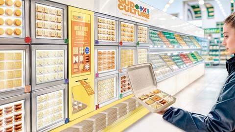
Reset cheese for the modern cheese lover. That’s the challenge Design Bridge & Partners set itself when looking to create the next generation of packaging.
Instead of focusing on the “guilty pleasure” of cheese, the agency chose to improve consumer understanding of the product from a holistic health perspective.
Its Gud Culture brand highlights the vitamins and good fat content, as well as the inclusion of conjugated linoleic acid, which may help ease inflammation.
The packaging uses vivid colours to attract consumers, and a playful visual code – comprising stylised cheese shapes – to signpost the health benefits within.
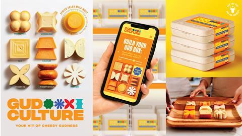
Gud Culture combines health and wellness with snacking to “provide science-led, perfectly portioned pieces of dairy goodness”, says Helen Hughes, Design Bridge sustainability director, with bite-sized cheeses in the recommended daily amount of 30g. “By reappraising the size and shape into these small but precious forms, we can better emphasise the value they bring and justify a more premium positioning for cheese.”
The individual cheese cubes are wrapped in a plastic-free coating to lock in nutrients and extend shelf life by five to six days. The edible coating is made from the whey byproduct of cheesemaking.
The outer packaging – a fully recyclable cardboard tray and lid – can contain either cheeses curated by the brand or a pick & mix selection by the consumer.
“To really move people to new habits, we need to help them see cheese in a wholly new light,” adds Hughes. “One where small brings big benefits for people, planet and brand owners.”
Grin/ No Whey!
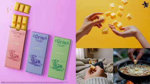
Cornering the cheese snacking market was also top of mind for Born Ugly which put forward two propositions on new ways to package and market the product.
We have many formats of cheese in the market: block, sliced and grated. But one thing yet to be established is bar.
“The cheese category is a commodity, a wall of often uninspiring and identical looking cheeses,” the agency explained. “Sure we see, grated cheese for convenience, slices for specific occasions and miniatures for lunch boxes. But how about reforming cheese to the ultimate, versatile and accessible cheese?”
Its Grin proposition is designed to tap into the snacking and chocolate market by forming the typical block into a bar, enabling consumers to break a piece off to eat or stir into a sauce.
It has the added accessibility benefit that it is easier for those with mobility issues rather than using a knife, the brand says.
It suggests a range of different and exciting bars if different cheeses with pieces sized for the ideal experience.
“Snap it, snack it, share it, chef it!” the agency says.
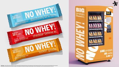
Born Ugly’s next suggestion was a “No Whey!” protein bar offering a “delicious savoury alternative to the large, dense and often sweet” category. The design would take the on-the-go cheeses and reposition them from “school lunch boxes to gym bags”.
As with Design Bridge’s proposition, Born Ugly is banking on cheese losing its “unhealthy associations” and amplifying how it is an excellent source of protein and calcium.
Ice cream
Ice Cream Garden/Scoops of Rainbow
Large-format ice cream is dominated by single-use cartons. But what if they were deliberately designed to be reusable?
That’s the question posed by Squirrels & Bears in the first of two ice cream packaging concepts.
It’s called Ice Cream Garden – designed to “set a new standard for sustainability and accessibility through its packaging”.
Each tub features a seed associated with the flavour of ice cream – such as apple, lemon or blueberry – embedded in the lid. Consumers are invited to plant them in the empty container (soil not provided).

The environment is also considered in the choice of variants. Ice Cream Garden “aims to offer seasonal fruit flavours sourced from local farms, bringing the freshest and most vibrant tastes that each season has to offer, actively reducing environmental impact and supporting local producers”, says Squirrels & Bears.
To support this, each tub sports a QR code that allows shoppers to see precisely where the product’s dairy and fruit were sourced.
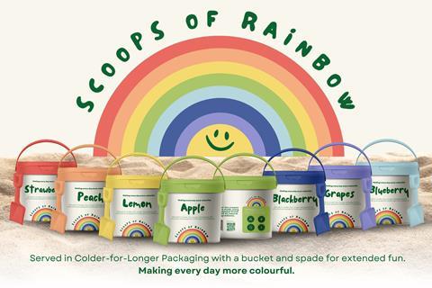
For its second idea, Squirrels & Bears has taken a child-focused approach. Its Scoops of Rainbow brand is designed to encourage outdoor play. Once used, the ice cream tub, complete with handle and shovel-like scoop, can double as a bucket and spade.
Both concepts are 100% recyclable and feature antimicrobial and antibacterial materials to ensure the ice cream stays fresher for longer.
They also include scented packaging to allow visually impaired consumers to identify flavours through a natural aroma, applied without affecting the safety or sustainability of the process. Plus, the cartons use thermal tech to keep the ice cream colder for longer.
Fancy
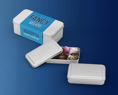
Decrying the lack of sustainability in current ice cream packaging, And Rising came up with Fancy, a reusable and refillable ice cream tub for shoppers to take into store time and time again.
The agency suggested working with water bottle manufacturer Ocean Bottle to create the “high-tech gelato tubs” made of insulated stainless steal and wrapped in recycled plastic from the ocean. This would ensure ice cream was cold for up to 10 hours, if not kept in the freezer.
The tubs will be available in two sizes – family and individual – with an optional insert allowing consumers to choose different flavours at once. It will even have a handle to make it easier to carry home.
In an additional move, the agency called for the creation of ice cream refill counters in supermarkets. It took inspiration from LA’s Ehrewon supermarket where smoothie counters have had huge financial success and garnered significant social reach. This has the added benefit of resolving a challenge supermarkets are facing, according to the agency, that of a lack of in-store experience.
The sustainability doesn’t stop there though, the agency is keen to ensure that the inside of the tub is just as environmentally friendly as the tub itself. It suggests partnerships with fellow B Corps like Pip & Nut, Proper popcorn, Tony’s Chocolonely, Illy Caffe and Oddbox to amp up the flavour without sacrifice.
While the price point would be premium, the team is keen to emphasise that over time “reusability means real value” as after a larger upfront cost refills would be more economical.
Butter & spreads
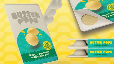
Butter Pops
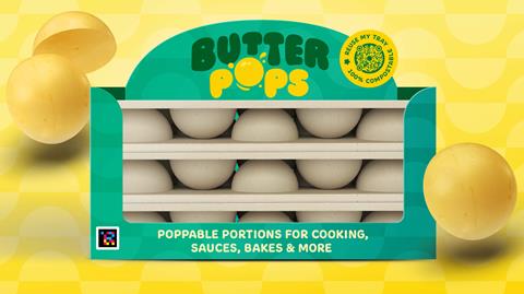
For the butters and spreads category, Live & Breathe wanted to offer convenience while also avoiding food waste.
That’s why its suggested Butter Pops brand provides “perfect portions with every pop”. The product aims to tempt eco-conscious consumers by providing semi-spherical butter portions that pop out of the pack effortlessly when refrigerated.
“Butter Pops offers an eco-friendly, cost-effective solution for busy families,” Live & Breathe explains.
“The easy-to-use butter portions are ideal for cooking, sauces and bakes, fitting easily into hectic routines.”
As well as hoping to make cooking easier and reduce the 490,000 tonnes of dairy wasted each year in the UK, Live & Breathe also wanted to offer an alternative to typical plastic packaging.
With plastic recycling rates at only 44%, according to the agency, its creatives suggested using sustainable pulp-based material as a base for Butter Pops packs. The packaging is both compostable and recyclable kerbside, while still waterproof and oil-resistant.
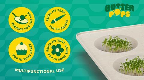
Plus, Live & Breathe has used the brand’s outer packaging to emphasise the different ways the trays can be repurposed, from an egg cup to a paint tray. A QR code on pack offers more handy reuse ideas.
“The sustainable packaging reduces waste and promotes responsible shopping, offering excellent value and helping families live by their eco-friendly values,” the agency says.
To further attract shoppers, Live & Breathe has used bright colours and playful graphics, which it believes – supported by the “fun and memorable” product name – would create high brand awareness and recall.
Churn’d
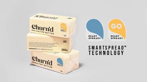
In the eyes of the team at Nexus, the butter category has a big opportunity to gain basket space from the more heavily processed spreads. The only thing standing in its way is spreadability.
“With a movement and demand for real foods, and shoppers understanding the meaning of ‘ultra processed food’ there’s a hunger for real butter as people are turning their backs on spreadable oil-infused options,” the team explains.
Nexus’ innovation which hopes to navigate the twin challenges of convenience and having a clean ingredient deck involves cleverly tweaking the packaging to make it more user friendly and to get that perfect spread every time.
“Churn’d is about making the experience of spreading with natural butter easier,” they add.
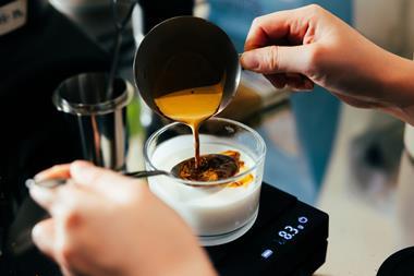
To make this happen, says the team at Nexus, is SmartSpread® technology which tells you when Butter is ready for spreading. Using recyclable, heat sensitive foil, the “ready, spready go” tab changes colour to alert consumers to whether the butter is hard or spreadable, or somewhere in between.
What Nexus is describing as a premium product is targeting shoppers trying to find better quality butter products with more traceable provenance.
Tackling issues around sustainability and improving packaging recyclability was also key. Hence the decision for it to be “carefully wrapped in regeneratively farmed, biodegradable seaweed, that preserves its quality and also our planet,” says Nexus.
Yoghurt
Cal
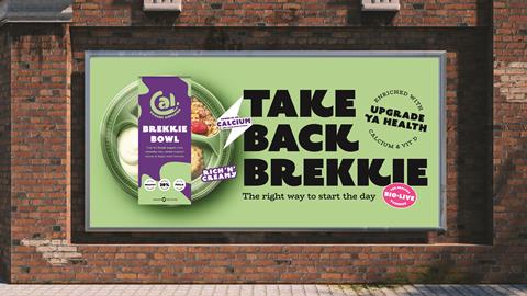
Many issues in the yoghurt space stem from the lack of convenience in current pack designs – from difficult-to-use formats to inappropriate portion sizes, says Nathan Ball, creative director of Equator Design.
So, with an emphasis on convenience, the agency has reinvented split pot yoghurt, taking cues from lunchtime salad bowls for its Cal brand, aimed at children.
“Cal redefines kids’ yogurt by making it nutritious, delicious, and fun, all while supporting sustainability and accessibility,” says Ball.
“With Cal, parents can trust that their children are getting the essential nutrients they need in a yoghurt that kids will love, ensuring they are fuelled for their day the right way.”
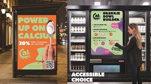
Each Cal bowl features yoghurt, sauces such as honey, raspberry ripple and salted maple, and add-ons like granola, cacao crisp cereal and freeze-dried berries.
“Cal’s innovative approach includes mix-in toppings for a customisable breakfast experience, making it the perfect start to the day and fuelling kids the right way,” Ball says.
A key element of children’s yoghurt is health, he points out. That’s why Cal emphasises benefits such as keeping kids fuller for longer, maintaining gut health through live cultures, and providing a high calcium content in every portion.
Equator also wanted to confront the challenges posed by mixed materials, which complicate recycling. That’s why Cal uses biodegradable plastics and single material designs to simplify the recycling process and reduce the brand’s environmental impact.
Finally, Equator has suggested an innovative brekkie bowl vending machine to offer yoghurt and toppers for on-the-go breakfast options.


No comments yet