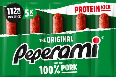
Peperami is rebranding in a bid to lure “mainstream and younger” shoppers to the brand.
The brand has unveiled a new logo and redesigned packaging, which will roll out this month across its core range of products, including its signature meat sticks, Snack Boxes and Chicken Bites.
The packaging would retain Peperami’s “iconic green colour”, updated with a new matte finish and “fresh photography” to achieve a “contemporary” look, said the brand.
Key nutritional information would be highlighted on the front of pack, with emphasis placed on the protein content, added Peperami.
Peperami explained the redesigned packaging would “appeal to the needs of both the mainstream and younger consumer”, while “maintaining brand familiarity”.
Head of marketing, Pavan Chandra added that the refresh would help Peperami “stand out in the crowded snacking market”.
“We believe this new packaging and redesign is a vital step in bringing Peperami’s family favourites to many more consumers,” he added.
Peperami worked closely with global agency 1HQ on the rebrand.
Guy Hepplewhite, head of brand communications at 1HQ, said that the new pack designs were “more reflective” of the modern consumer.
Peperami said it would continue to invest in campaigns that would help it diversify its appeal in 2021.
Research commissioned by The Grocer and carried out by Harris Interactive last November found that meat snacks – such as salami sticks, pork crackling and chicken bites – were most popular among 25 to 34-year-olds.
And Peperami isn’t the only supplier hoping to tap this growth. Premium snacks brand Serious Pig, for instance, recently smashed a £350,000 crowdfunding target to accelerate growth, expand its range and bolster its sustainability credentials.









No comments yet