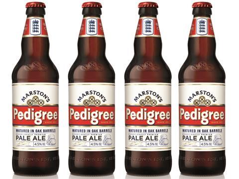
Marston’s is rolling out a new look for its flagship ale, Pedigree, following a slump in sales.
The redesign, carried out by London branding agency Butcher & Gunderson, replaces the oval bottle label with a rectangular one that makes use of straight lines and a more contemporary typeface.
The new artwork also emphasises the beer’s Burton-on-Trent provenance, and its traditional brewing method, with an illustration of three oak barrels and the signature of the brewery’s on-site cooper. As the official beer of England cricket, the bottle also retains the England Cricket Board endorsement on the neck label.
Retail sales of Pedigree have fallen in the past year, with bottles down 11% to £3.7m and cans down 17% to £1.9m [IRI 52 w/e 31 January 2015].
“In a competitive market place we wanted a better stand-out appeal on shelf for the shopper,” said Marston’s marketing manager Gaynor Green, “while reminding them of our unique brewing method. We remain enormously proud to be the only brewer left in the world that still ferments its ale in the traditional Burton Union System using oak barrels, and wanted the label to reference our story.”
The new look would allow the brand to communicate with a wider and younger audience while not alienating the existing consumer, said Butcher & Gundersen creative director Zeffy Dougekou. “On shelf, the standout of the new rejuvenated Pedigree design has dramatically improved.”










No comments yet