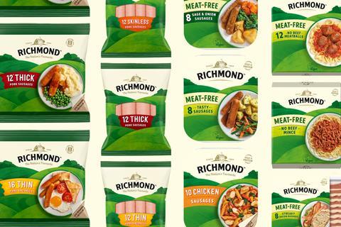
Richmond has launched new packaging across its entire portfolio to mark a new era for the brand.
The Pilgrim’s Food Masters brand, which has moved beyond pork sausages in the last three years, has unveiled a new design it said would build on its heritage.
Created by brand identity agency Bloom, the new design incorporates photography to inspire shoppers with different ways to use Richmond products at mealtimes. The packaging has maintained the brand’s recognisable green hills but with more warmth and depth, alongside the addition of sweeping banners for product names.
The Richmond house logo has also been reimagined with more detail to now incorporate the brand’s ‘nation’s favourite’ status on pack.
The range was “updated with a suite of new assets and modernised photography, and the result is a new identity full of meaning that instils a sense of belonging and a warm welcome”, said Jonny Harris, design director at Bloom.
The new look was “more reflective of where we are now as a brand” – including plant-based, said Chris Doe, marketing controller for Pilgrim’s Food Masters. “It’s an exciting time as we continue to launch into new categories, and this design supports us by providing a contemporary, cohesive look and feel.”
Richmond has also upped its sustainability credentials: 40% of plastic has been removed from the fresh pork range, whilst the frozen pork range now has 33% less packaging, saving more than 42 tonnes of plastic annually.
Recyclable top-film has replaced existing lidded film in the chicken range, making the packaging 100% recyclable from kerbside.










No comments yet