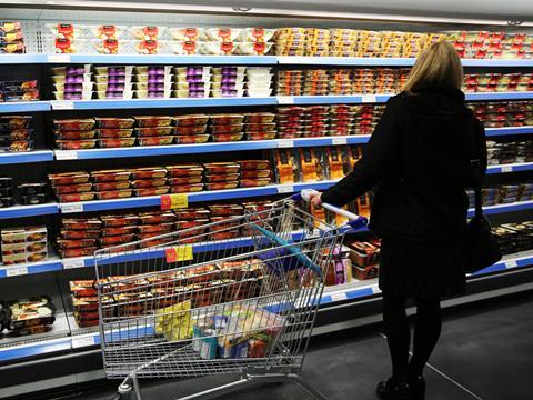
It’s a rare product that doesn’t want to “stand out”. Brands invest heavily to grab the attention of consumers from their position on the shelf, but like a parent supervising an over-tired toddler near a swimming pool, the endless shouts of “look at me!” may be starting to wear thin with shoppers. At least, that’s what the folks at PubLAB suggest.
PubLAB is a scientific research unit aimed at decoding the mystery of why pub-goers and shoppers opt for one pint over another. It’s just released the results of a new consumer behaviour study – and the results should give marketers pause for thought.
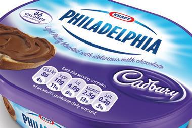
Instead of eye-catching presentation, fancy packaging and shelf “stand-out”, what consumers are really looking for is clear and concise information, the PubLAB study has found.
While something with an outrageous name and a big bold label (a Tactical Nuclear Penguin, for example, or something that’s just bright neon yellow) might draw immediate attention, it can also end up bombarding consumers with far too much visual stimulation.
“Distinctiveness and visual attention are not the same,” warns Tim Froggett, senior lecturer in marketing at Anglia Ruskin, the university PubLAB calls home.
“An object may be distinctive simply because it is different from other objects surrounding it. And the factors creating distinctiveness are not necessarily the same as those driving attention, consideration and choice.”
Faced with shelves full of shouty packaging, shoppers zero in on simple, straightforward data points to inform their buying decisions, Froggett adds. “In crowded supermarket environments, shoppers direct attention to the centre of objects where they expect to find choice-related information such as product type, brand name or details of flavour characteristics.”
Brands that deliver on such “task-relevant information”, as Froggett calls it, stand a better chance of being picked up than those that prioritise looks over substance.
It’s an interesting, counterintuitive message: the visual cues that marketers have traditionally leaned on – like colour, logos and on-pack imagery – may get you onto consumers’ radars, but they won’t necessarily get you into baskets.







No comments yet