Mobile ready hero images title pic_one use only

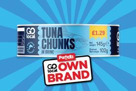
They have a silly name and seem like the kind of obscure detail no one outside of technical departments cares about, yet mobile ready hero images (that’s product images that have been optimised for mobile phones, to you and me) have become an unlikely hot potato in the world of online grocery retail.

People & companies quoted in this article

Oliver Bradley, Unilever

Dr Sam Waller, University of Cambridge

Paul Reid, GS1

Richard Stanley, Nielsen Brandbank

Debbie Wilson, Mars Petcare

Ed Bradley, Virtualstock

CCEP

Tesco

Right now, more than a 100 brand owners and retailers, including Unilever, P&G, Tesco, Asda and Carrefour, are battling it out in a working group led by global standards body GS1 to define rules and guidelines for such images.

It’s a project that has already seen a surprising amount of drama. Participants describe “a little soap opera” played out on LinkedIn and in private groups, where senior industry executives vigorously argue their case and have to be reined in by GS1 facilitators and told to be “less shouty”.

So why are mobile ready hero images so controversial? And what are the chances a common standard can be agreed?

It all starts with the hypothesis that normal packshots - the kind that are widely used on grocery sites and show the product as it looks in real life - don’t really work on mobile phones. They are fiddly, on-pack information is hard to see and the user experience is poor; plus, shoppers risk picking the wrong product by mistake, especially as many scroll rapidly and add products to their baskets directly from search instead of going to individual product pages.

”Online shopping is cross-generational, and we need to make it as accessible as possible”

Based on this idea, Unilever - led by its global ecommerce experience design director, Oliver Bradley - started working with the University of Cambridge on new images designed specifically for mobile. “Online shopping is cross-generational, and we need to make it as accessible as possible,” Bradley explains. “People primarily shop online because it’s fast and convenient, and mobile ready hero images are about making the experience even better.”

Oliver Bradley_Unilever_headshot web

Click or tap here for a Q&A with Unilever’s Oli Bradley on key questions and challenges to the Unilever/Cambridge model

Over the course of four years, they developed eight templates designed to make it easier to differentiate product type, brand, size and variant - in some cases by zooming in, cropping or cleaning up the pack shot, in other cases by adding side strips and so-called lozenges to make key product information stand out more.

They put the images through extensive tests against standard packshots, including eye-tracking studies, and reported impressive results: sales of Magnum soared by 24% when hero images were used; Simple skincare sales went up by 19.6%.

It didn’t take long before other brand owners took notice and for Unilever’s ecommerce team to become de facto evangelists for MRHIs. They even released their templates on an open source basis, allowing anyone to use them free of charge. Today, mobile images based on the Cambridge model are used in 30 markets worldwide.

So far, so good. However, not everyone likes the images Unilever and Cambridge created. Although most UK grocers accept some types of hero images, several have been less than keen on certain aspects: the strips and lozenges make sites look too busy and cluttered, they argue; the images don’t work with so-called retailer overlays (ie on-site flashes like ‘special offer’); plus, there’s a general sense of unease about brands wanting to drive the look and feel of how their products are presented on ecommerce sites, when retailers believe this should be up to them.

Above all, they are concerned that, as more brands have followed in Unilever’s footsteps and started experimenting with MRHIs, lots of different interpretations and approaches have emerged, making sites look inconsistent.

How different brands are using mobile ready hero images

Mars, for example, is largely sticking to the Unilever/Cambridge guidelines and is using some ‘clean pack’ hero images for its petcare products, though it has so far steered clear of versions requiring strips and lozenges. ”In this first phase, we wanted to remain within pack,” says digital trade content manager Debbie Wilson. “We’ve not gone as far as Unilever with our images - we wanted to make sure they look like the pack.”

Coca-Cola, on the other hand, has developed its own hero images, with a different style of lozenge and information flashes that break the outline of the pack, that it says are specifically suited to the soft drinks category, and is currently using these on Schweppes products. 

Lack of investment in platforms

Cue GS1 and a global quest to create rules and standards for mobile images everyone can live with.

That, however, is proving to be easier said than done. Some retailers are simply not buying into the rationale for dramatically different mobile images. M-commerce sales are small, and while the likes of Bradley argue mobile is the future, the idea of spending time and effort to optimise mobile assets right now has limited appeal.

”If e-commerce was lucrative, there would be a large amount of money spent on customer experience”

Prohibitively thin margins in e-commerce are part of the problem, believes Dr Sam Waller, one of the Cambridge researchers working with Unilever. “These e-commerce teams are in constant firefighting mode,” he says. “There is something about the market dynamics in e-commerce, very low margins and very high volume, that makes initiatives like this challenging. You get a lot of knee-jerk reaction. If e-commerce was lucractive, there would be a large amount of money spent on customer experience, but right now there is no budget for platform development.”

Richard Stanley, product manager at Nielsen Brandbank, agrees a lack of platform investment and development is a key hurdle to retailers embracing mobile hero images in all their forms. “The available technology is a big reason for some of the resistance,” he says. “This issue has really crept up on the industry, and the platforms used by many retailers right now are just not flexible enough to deal with the increased demands hero images bring.”

Such demands include the ability to selectively serve different images based on whether the user is viewing the site on desktop or mobile or to move and adjust retailer overlays depending on each image.

Disagreement over what best serves the user

But even where retailers say they see the importance of mobile, they don’t always agree with the Cambridge/Unilever analysis of what makes for a good user experience.  “Retailers like Tesco believe users are actually quite happy to get extra information through the product description. They don’t think the image has to do all the work,” says one GS1 participant.

Tesco, for its part, says: ”We want to make it as easy as possible for customers to shop online with us and we work hard to offer them high-quality product images. We are pleased to be part of the GS1 group and are committed to working in partnership with our suppliers on a clear and consistent approach.” The retailer did, however, release guidance on product images earlier this year that, in effect, clamped down on strips-and-lozenges variants of mobile hero images.

Tesco Finest own label bacon_low res do not use

Retailer overlays, as this shelf life flash on a Tesco bacon product, are a potential tension point in the GS1 discussions

The sales uplift cited by Unilever in its own testing has also raised eyebrows, with some retailers saying their own tests don’t show the same level of impact. This could partly be down to different parameters for each test, but Ed Bradley, co-founder of Virtualstock, says retailers and brands should not be focused too narrowly on uplifts in any case. “Returns are equally important. If you create images that mean users pick the right product and you are having to deal with fewer returns, then that’s very valuable in its own right.”

There’s also been pushback from several brands. “Some are saying, we can’t adopt the Unilever solution - it’s not right for our category,” says one source. “We need something that works for everyone, not just for the Unilever portfolio.”

Stanley says some alcoholic drinks brands in particular have been concerned zoomed-in hero images won’t do their bottle designs justice. “Some whiskys and liqueurs have iconic bottles and these brands are really not keen on having their bottles tinkered with.”

“It can’t just be, ‘oh, I don’t like what Unilever have done’”

And CCEP says it decided to develop its own approach because the soft drinks category has unique demands. ”Within the soft drinks category it is a challenge for some products to display key shopper information on a mobile format due to the long thin nature of the product,” says a CCEP spokesperson. ”From the very start, we collaborated with retailers in GB to develop a solution together. Taking the Schweppes 1l PET format as an example: we conducted several research phases including qualitative focus groups and interviews, quantitative surveys, eye tracking and AB testing. As our retailers highlighted the need for a consistent shopper journey, we approached the project through a category lens with a strong focus on shopper behaviour. With this in mind, we have collaborated with other soft drinks suppliers to share learnings and create a consistent solution for the category.”

The idea of putting forward different ideas is fair enough, says Waller. Any new approach that’s well researched, scalable and backed by evidence should be given due consideration. “If you have another idea, put it out there. But don’t criticise without coming up with alternatives. It can’t just be, ‘oh, I don’t like what Unilever have done’ or ‘I don’t like strips’. That’s not good enough. There has to be a proper process and evidence.” 

Small brands at a disadvantage?

Providing that kind of evidence, however, is a tough ask, especially for smaller brands. Already, some are raising concerns that the Unilever/Cambridge model - and the new digital artwork it requires - could be prohibitively expensive for SMEs. Brandbank is working on a new solution for mobile hero images, set to launch in January, which Stanley says will cost brands less than £100 for an optimised image, but he agrees concerns about financial implications need to be taken seriously. “It’s very important that the GS1 guidelines don’t favour big brands.”

Further friction has been caused by Unilever’s unique - and at times tricky - role in the GS1 project. The company has put more resources than anyone into hero images (indeed, many acknowlege Unilever, and Bradley in particular, are the reason anyone is talking about MRHIs right now), yet it is now at the centre of a process that looks to unpick key aspects of its work.

Bradley says he is open to any solution that improves the shopper experience, but rival brands and some retailers worry the GS1 process will inevitably be steered towards the Unilever/Cambridge model - not least because Bradley himself is one of the group’s three co-chairs.

“This is not a rubberstamping exercise”

Paul Reid, the GS1 UK lead for the working group, is adamant that won’t be allowed to happen. “This is not a rubberstamping exercise,” he says. “Oli won’t have any more say than anyone else.”

Still, the project faces a challenging road ahead. Several GS1 participants already predict privately the strips and lozenges of the Unilever model won’t survive the process. Others say opening up the Cambridge model to brand-owned fonts should be a key consideration, especially as it would make other brand owners feel like they get to ‘own’ their hero images and don’t have to stick to a Unilever-defined protocol.

In addition, some believe retailers might insist on having the top left or right corner of each image ‘reserved’ for their overlays instead of allowing brands to own the entire 16mmof the image - a compromise Waller warns would amount to a “lowest common denominator approach” that would be “better than nothing but not necessarily as good as it could be”.

But Reid insists no decision has been taken, and says there is plenty of common ground to build on. “Everyone agrees: the foundations of the Cambridge approach are sound. More and more people are shopping on mobile, and we need to improve the speed and accuracy of mobile shopping. The challenge is, lots of people are providing this information in slightly different formats, so we need to create consistent rules for everyone - and I am confident that is what we will ultimately be able to do.”

Even Waller, despite his concerns about the working group ultimately settling for “second best” in order to get a deal done, says he is “cautiously optimistic”. “There is a lot of enthusiasm for it,” he says. ”This GS1 working group is the hottest topic in e-commerce right now. It’s the biggest thing I’ll ever work on: it has the potential to affect every product, on every device, in the world. The scope is enormous and there’s a real chance to make things better.”

With so many different takes on what ‘better’ looks like, however, it may well take a heroic effort to get there.

Mobile ready hero images title pic_one use only

Multimedia toolkit: key resources to help you take your next step on hero images

Key contact: Paul Reid, GS1 working group UK facilitator (paul.reid@gs1uk.org)

Video: Unilever’s Oliver Bradley and Dr Sam Waller of the University of Cambridge present at Clavis’ e-commerce conference

Website: Hero image guidelines from Unilever and Cambridge

Document: GS1 call to action on its mobile working group

Article: What is a mobile ready hero image? by Oliver Bradley

Slides: Unilever on why side strips are important for communicating variants