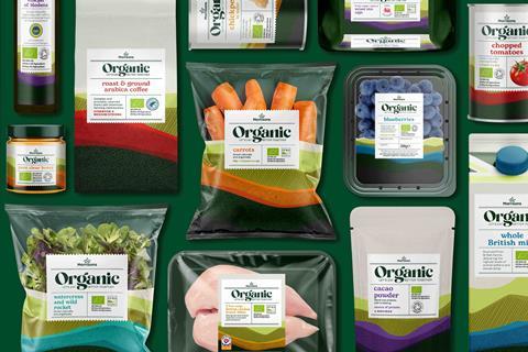
Morrisons is looking to “rejuvenate” its organic range with revamped branding.
Designed to conicide with Organic September, the new-look range will be brought together under ‘Let’s Eat Better Together’ messaging – designed to show Morrisons’ dedication to “a more natural future”.
The range, designed in partnership with StormBrands, features “natural earthy colours linked to the landscape”. It also includes an illustration to champion the “rich, diverse layers of our environment and how it connects to everything we do”.
The new design also has a flexible label layout to create an “artisanal ‘batch’ feel”. Each line has its own colour scheme to aid navigation and differentiation, comprising three tones: a light layer, an earthy core and a rich colour base.
Morrisons employed StormBrands to “rejuvenate” the organic range, and create a refreshed brand positioning that reflected changing consumer behaviour around organic products.
The agency was also asked to help educate consumers on what organic stood for, attract triallists and convert occasional users through an easy-to-navigate value proposition.
“Having defined wider sources of inspiration driving both shopper and consumer awareness and consideration, we’ve now elevated the Morrisons organic range from following legacy category codes at a value for money price to setting new standards that respond to increasing consumer experimentation and aspiration around food, diet and supply chain,” said Zoe Phillipson, StormBrands creative director.
“The resulting design system is fresh and contemporary with a beautifully crafted logo that encapsulates the Morrisons organic brand story.”
The redesign followed a wider strategic update to Morrisons’ health and wellbeing portfolio such as the relaunch of both the Counted and FreeFrom ranges also delivered by StormBrands earlier this year.







No comments yet