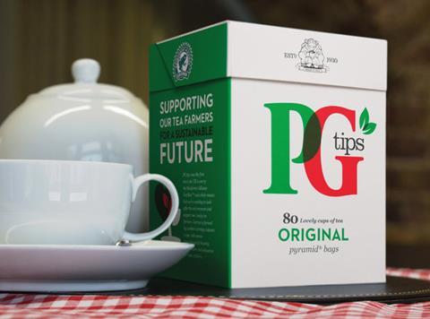
Unilever is this week rolling out a new look across its entire PG Tips range.
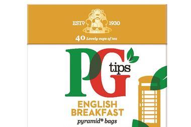
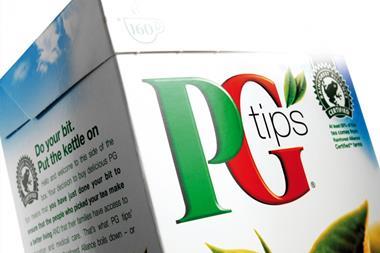
Described as the brand’s biggest packaging overhaul in 19 years, the design features a new “contemporary” logo that retains the brand’s red, green and white colour scheme.
Unilever said the revamp, which is rolling out now, was intended to make the brand easier to shop instore, reaffirm its authority within the category, and grow drive sales.
The overhaul comes as the performance of the everyday tea category has cooled, and follows a 3.3% slump in sales of PG Tips to £144.6m last year [Nielsen 52w/e 3 January 2015].
“We’ve listened to our consumers and redesigned our packaging to make the brand more relevant to shoppers, especially the younger consumer,” said PG Tips senior brand manager Kate Hearn. “We also believe that the clear, fresh new look, with a bigger and bolder PG tips logo, will make it easier for shoppers to find their favourite tea brand in the busy supermarket aisle.”
The rsp of the PG Tips range will remain the same, as will the formats and case sizes.






No comments yet